Short description
Build a reusable Scorecard (KPI card) component in packages/ui that displays a single metric value with label, optional trend indicator, and compact number formatting. This is the first of 5 chart components (scorecard, line/area, bar, donut, table) being added to standardize data visualization across GoodDollar analytics.
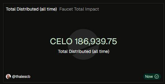
A Scorecard shows one key metric at a glance: a large formatted number, a descriptive label, and optionally a change/trend indicator vs. a prior period. E.g. "Total G$ Spent: 1.9K (+12.5% vs last 7d)".
Reference pattern: Ant Design's Statistic component (title, value, prefix, suffix, precision, formatter), adapted for the GoodWidget cross-platform stack.
Which repos and packages to work with
- Target:
GoodDollar/GoodWidget
- Component lives in
packages/ui/src/ (NOT a specific widget package) — named export from packages/ui.
- Follow the component structure pattern of the existing
FundingDistributionChart: https://github.com/GoodDollar/GoodWidget/blob/master/packages/governance-widget/src/FundingDistributionChart.tsx
- Must use Tamagui primitives from
@goodwidget/ui (Stack, YStack, XStack, Text, Heading) and useTheme() for all colors — no hardcoded values.
- Must use
react-native-svg for all graphical elements (trend arrows), for cross-platform compatibility.
Props / API surface (MVP)
| Prop |
Type |
Required |
Default |
Description |
value |
number |
yes |
-- |
The metric value to display |
label |
string |
yes |
-- |
What the metric represents (e.g. "Total G$ Spent") |
prefix |
string |
no |
-- |
Unit before value (e.g. "G$", "$") |
suffix |
string |
no |
-- |
Unit after value (e.g. "%", "wallets", "USD") |
format |
"compact" | "decimal" | "none" |
no |
"compact" |
Number formatting mode |
decimals |
non-negative integer |
no |
1 for compact, 2 for decimal |
Decimal precision |
trend |
object |
no |
-- |
{ value: number, direction: "up" | "down" | "neutral" } |
trendLabel |
string |
no |
-- |
Comparison period label (e.g. "vs last 7d") |
size |
"sm" | "md" | "lg" |
no |
"md" |
Sizing preset |
testID |
string |
no |
-- |
Test identifier |
User flows, states and behaviours
Compact number formatting rules
< 1,000: show as-is with decimal precision>= 1,000: X.XK (e.g. 1,900 → 1.9K)>= 1,000,000: X.XM (e.g. 2,400,000 → 2.4M)>= 1,000,000,000: X.XB>= 1,000,000,000,000: X.XT"decimal" mode: full number with thousands separator (comma) and specified decimal places"none" mode: render value as-is (string passthrough)
Trend indicator behavior
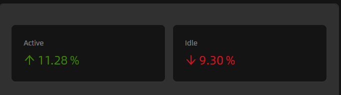
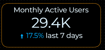
direction: "up" — upward arrow SVG icon + value formatted as "+X.X%", theme success colordirection: "down" — downward arrow SVG icon + value formatted as "-X.X%", theme error colordirection: "neutral" — horizontal dash SVG icon, theme secondary text color
Visual layout (vertical stack, centered)
[ Label ]                        <- theme secondary text color, caption font
[ G$ 1.9K ]                      <- theme primary color, heading font, bold (prefix + formatted value + suffix)
[ +12.5% vs last 7d ]            <- theme success/error color, caption font, with arrow icon
Design reference
Constraints
- Must use
react-native-svg for all graphical elements (trend arrows).
- Must use Tamagui primitives from
@goodwidget/ui and useTheme() for all colors — no hardcoded color values.
- Must support all 3 GoodWidget delivery pipelines: React web, React Native, Web Components.
decimals prop must be a non-negative integer (0, 1, 2, ...).- Component lives in
packages/ui/src/, not a specific widget package.
Mock data (for testing/screenshots)
| Label |
Value |
Prefix |
Suffix |
Format |
Decimals |
Trend |
Trend label |
Renders as |
| Total G$ Spent |
1900 |
G$ |
-- |
compact |
-- |
-- |
-- |
"G$ 1.9K" |
| AI Credits Used |
284.50 |
$ |
-- |
decimal |
2 |
-- |
-- |
"$284.50" |
| Active Days |
28 |
-- |
-- |
none |
-- |
-- |
-- |
"28" |
| Unique Wallets |
47 |
-- |
-- |
-- |
-- |
{value: 15.3, direction: "up"} |
vs last 7d |
-- |
| Daily Flow Rate |
2450000 |
G$ |
/day |
compact |
-- |
-- |
-- |
"G$ 2.5M/day" |
Acceptance criteria
Out of scope (cataloged for future versions)
v2 (nice-to-have): sparkline (mini inline area chart), leading icon slot, loading/error states, count-up animation, onPress handler, tooltip, background/border color overrides.
v3 (polish/final): target/goal progress indicator, inline comparison value, compact-mode boolean for dashboard grids, ariaLabel override, theme-level color preset selection, padding/margin overrides, per-element typography overrides, scientific notation, subtitle text, group/decimal separator customization.
Reference
- Component pattern:
FundingDistributionChart in GoodDollar/GoodWidget
- Industry reference: Ant Design Statistic — same title/value/prefix/suffix/precision pattern
- This scorecard is the first of 5 chart components (scorecard, line/area, bar, donut, table) being built to standardize GoodDollar analytics visualization.
Create the plan (keep this section in the issue body)
Create the plan
Based on the above description create an execution plan in a new sub-issue and preserve the original issue content unchanged.
Do not execute the plan until given instructions to do so.
Sub-issue requirements:
- Title format:
[DRAFT][PLAN] <what issue is being planned>
- Type:
Task
- Description must start with:
<sub-issue title>
- Link the sub-issue back to this parent issue.
Instructions when creating the plan:
- Map relevant files that are too be used as reference from all repos mentioned
- import existing @GoodDollar packages
- Map new components that should be created. Assess when a new component should be created in the new savings widget package or made part of the reusable packages/ui
Plan specification required sections:
- Required states, flows, and behaviors
- Execution plan
- acceptance criteria
- human-reviewer checklist
Short description
Build a reusable Scorecard (KPI card) component in
packages/uithat displays a single metric value with label, optional trend indicator, and compact number formatting. This is the first of 5 chart components (scorecard, line/area, bar, donut, table) being added to standardize data visualization across GoodDollar analytics.A Scorecard shows one key metric at a glance: a large formatted number, a descriptive label, and optionally a change/trend indicator vs. a prior period. E.g. "Total G$ Spent: 1.9K (+12.5% vs last 7d)".
Reference pattern: Ant Design's Statistic component (title, value, prefix, suffix, precision, formatter), adapted for the GoodWidget cross-platform stack.
Which repos and packages to work with
GoodDollar/GoodWidgetpackages/ui/src/(NOT a specific widget package) — named export frompackages/ui.FundingDistributionChart: https://github.com/GoodDollar/GoodWidget/blob/master/packages/governance-widget/src/FundingDistributionChart.tsx@goodwidget/ui(Stack,YStack,XStack,Text,Heading) anduseTheme()for all colors — no hardcoded values.react-native-svgfor all graphical elements (trend arrows), for cross-platform compatibility.Props / API surface (MVP)
valuenumberlabelstringprefixstringsuffixstringformat"compact" | "decimal" | "none""compact"decimalstrend{ value: number, direction: "up" | "down" | "neutral" }trendLabelstringsize"sm" | "md" | "lg""md"testIDstringUser flows, states and behaviours
Compact number formatting rules
< 1,000: show as-is with decimal precision>= 1,000:X.XK(e.g. 1,900 → 1.9K)>= 1,000,000:X.XM(e.g. 2,400,000 → 2.4M)>= 1,000,000,000:X.XB>= 1,000,000,000,000:X.XT"decimal"mode: full number with thousands separator (comma) and specified decimal places"none"mode: render value as-is (string passthrough)Trend indicator behavior
direction: "up"— upward arrow SVG icon + value formatted as "+X.X%", theme success colordirection: "down"— downward arrow SVG icon + value formatted as "-X.X%", theme error colordirection: "neutral"— horizontal dash SVG icon, theme secondary text colorVisual layout (vertical stack, centered)
Design reference
Constraints
react-native-svgfor all graphical elements (trend arrows).@goodwidget/uianduseTheme()for all colors — no hardcoded color values.decimalsprop must be a non-negative integer (0, 1, 2, ...).packages/ui/src/, not a specific widget package.Mock data (for testing/screenshots)
{value: 15.3, direction: "up"}Acceptance criteria
Out of scope (cataloged for future versions)
v2 (nice-to-have): sparkline (mini inline area chart), leading icon slot, loading/error states, count-up animation,
onPresshandler, tooltip, background/border color overrides.v3 (polish/final): target/goal progress indicator, inline comparison value, compact-mode boolean for dashboard grids,
ariaLabeloverride, theme-level color preset selection, padding/margin overrides, per-element typography overrides, scientific notation, subtitle text, group/decimal separator customization.Reference
FundingDistributionChartinGoodDollar/GoodWidgetCreate the plan (keep this section in the issue body)
Create the plan
Based on the above description create an execution plan in a new sub-issue and preserve the original issue content unchanged.
Do not execute the plan until given instructions to do so.
Sub-issue requirements:
[DRAFT][PLAN] <what issue is being planned>Task<sub-issue title>Instructions when creating the plan:
Plan specification required sections: