Matplotlib is great for plotting and works hand-in-hand with NumPy.

Importing Matplotlib is similar to importing NumPy, again using the as keyword to shorten the library name:
1. Create a new Jupyter Notebook named MatPlotLib Challenges.
2. In your program, add:
import matplotlib.pyplot as pltWith Matplotplib imported, you can use it to plot data.
Data visualization is a very important part of data analysis.
Machine learning commonly uses a graph called a scatter plot. Seeing the data plotted in a graph enables you to find patterns and clusters to better understand the data.

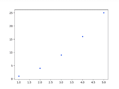
You can also use line plots that connect data points with straight lines. This will visualize the trend and which direction the data is going

x = [1, 2, 3, 4, 5]
y = [1, 4, 9, 16, 25]
Use the
plt.plot() function to plot the line.
2. Input both your newly created lists, x and y, into
plt.plot():
plt.plot(x,y)3. To make the line visible, include:
plt.show()Say you want to plot something other than a line, like points.
To create a scatter plot, inside the
plt.plot() function, pass in "ro" to modify the way your graph appears.
1. Update your code to plot red points on your graph instead of a blue line:
plt.plot(x,y,"ro")
plt.show()
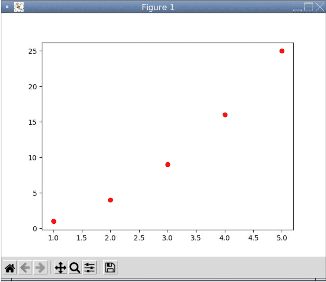
The first character, r , sets the color, while the second character, o , sets the type of line to be drawn.
- You can set the color to be red, blue, yellow, or green using
[r,b,y,g]. - Line types allowed are
[o,-,*,1,2,3,4,.].
For example,
plt.plot(x, y, "b.") will print a blue set of points.
Data visualization is very important for data driven stuff like machine learning!
- Replace the colors and the type of lines to see what the graph will look like.