An App Inventor extension that indicates the progress of an operation using an animated linear bar.
📅 Release date: 2022-04-19 12:30:00 (Asia/Hong_Kong)
🕛 Version: 1
📦 Package name: com.gordonlu.linearprogressbar
🛠️ Built with: Niotron IDE
Some things to note:
-
the Theme of Screen1 must not be Classic.
-
you cannot use a linear progress bar ID that you have previously used in the same screen.
📖 Documentation
Event blocks
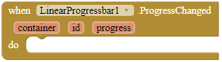
ProgressChanged
This event is fired when the progress of a linear progress bar has changed. The progress parameter returns the current progress value. If you have enabled Inderterminate for this progress bar, 'progress' will be 0.
Parameters: container = component, id = number (int), progress = number (int)
Method blocks
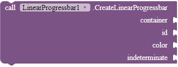
CreateLinearProgressbar
Creates a linear progress bar in the given container. If indeterminate is true, an infinite loading animation will be shown on the progress bar.
Parameters: container = component, id = number (int), color = color, indeterminate = boolean
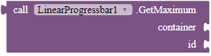
GetMaximum
Returns the upper range of the progress bar.
Returns: number (int)
Parameters: container = component, id = number (int)
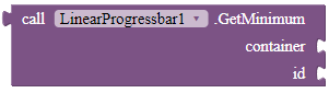
GetMinimum
Returns the lower range of the progress bar. Only works in devices with Android >= 8.
Returns: number (int)
Parameters: container = component, id = number (int)
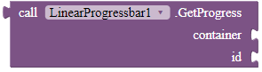
GetProgress
Get the progress bar's current level of progress. Return 0 when the progress bar is in indeterminate mode.
Returns: number (int)
Parameters: container = component, id = number (int)
IncrementProgressBy
Increases the progress bar's progress by the specified amount.
Parameters: container = component, id = number (int), value = number (int)

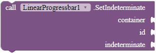
SetIndeterminate
Change the indeterminate mode for this progress bar. In indeterminate mode, the progress is ignored and the progress bar shows an infinite animation instead.
Parameters: container = component, id = number (int), indeterminate = boolean
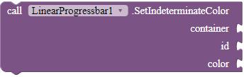
SetIndeterminateColor
Changes the indeterminate color of the progress bar.
Parameters: container = component, id = number (int), color = color
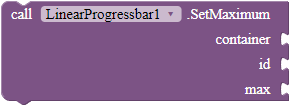
SetMaximum
Sets the upper range of the progress bar.
Parameters: container = component, id = number (int), max = number (int)
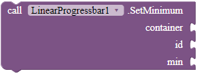
SetMinimum
Sets the lower range of the progress bar. Only works in devices with Android >= 8.
Parameters: container = component, id = number (int), min = number (int)
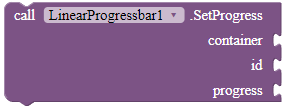
SetProgress
Sets the current progress to the specified value. Does not do anything if the progress bar is in indeterminate mode.
Parameters: container = component, id = number (int), progress = number (int)
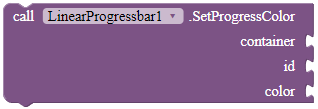
SetProgressColor
Changes the progress color of the progress bar.
Parameters: container = component, id = number (int), color = color
📚 FAQ
Q1: What is the difference between progress color and indeterminate color?
A1: You set the color of the progress bar with SetIndeterminateColor if your progress bar is indeterminate. Else use SetProgressColor.
Q2: What is a container?
A2: A container is used to contain your progress bar. The height and the width of the progress bar will be adjusted to the dimensions of the container. The container should only contain the progress bar, as if you put other components in the container, the progress bar will overlap them.
The container can be a horizontal or vertical arrangement, but not a scroll arrangement.