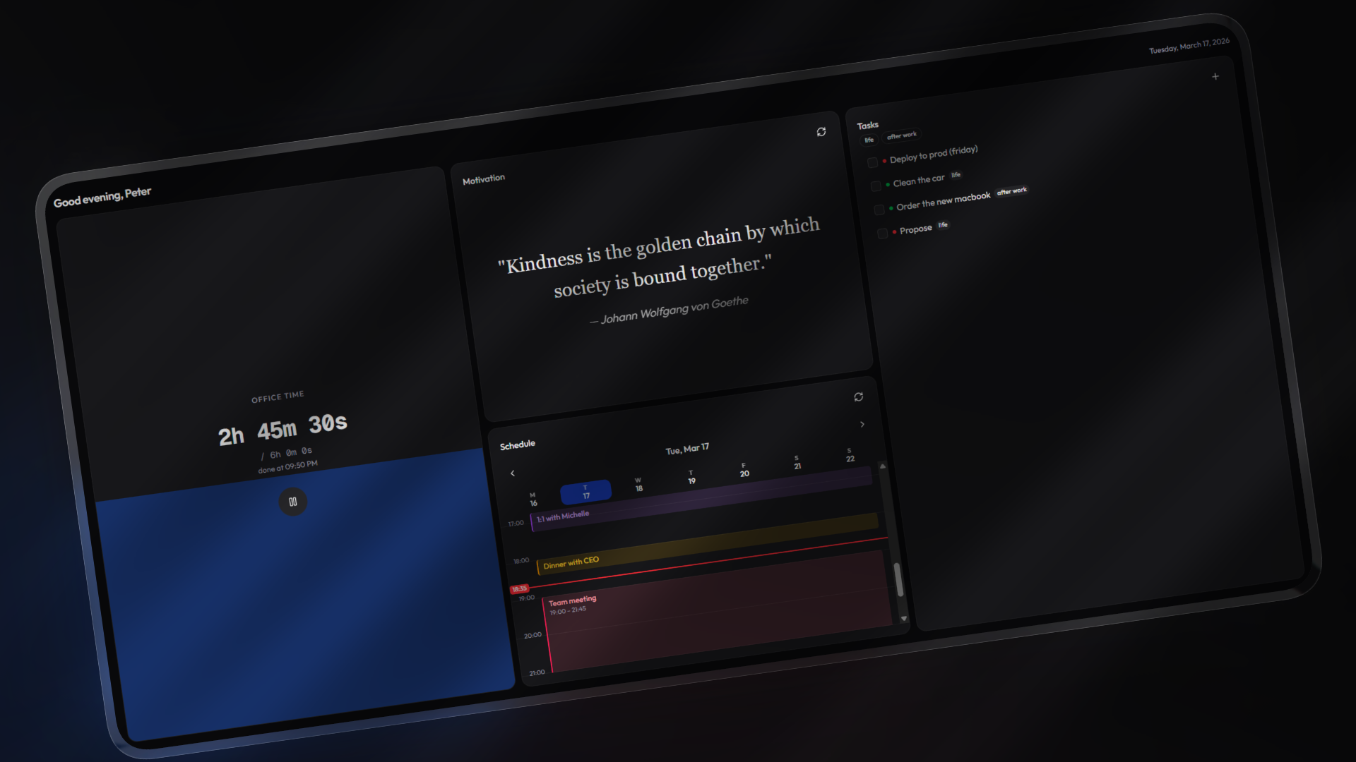
Bento is a personal dashboard built around a simple idea: a grid of cards you arrange yourself. Each card does one thing well — track time, manage tasks, view your calendar, check the weather. No accounts, no cloud dependency. Everything stays in your browser's localStorage, and you can export/import your workspace as a .bento file whenever you want.
The whole thing is built on a card registry pattern, so adding new cards is straightforward — create a component, register it, done.
Bento ships with full light and dark theme support. Toggle with the D key or through the command palette.
| Card | Description |
|---|---|
| Time Tracker | Stopwatch with a configurable daily goal (0.5–24h). Visual progress fill, estimated completion time, daily logs that persist across days, and a celebratory animation when you hit your target. |
| Calendar | Week view with hourly grid. Supports iCalendar (ICS) URLs, color-coded events, configurable start/end hours, and shows your tracked hours from the time tracker. |
| Tasks | Full CRUD with three priority levels (high, medium, low). Tag system with autocomplete from previously used tags, tag-based filtering, and bulk clear options. |
| Motivational Quotes | Pulls quotes from my own API that requires no auth and will always be free. Hit refresh for a new one. |
| Web Embed | Embed any website via iframe. Point it at docs, dashboards, or anything else you want at a glance. |
| Weather | Real-time weather via geolocation or manual coordinates. Temperature in Celsius or Fahrenheit, humidity, wind speed, and configurable refresh intervals with caching. |
| Pomodoro | Classic Pomodoro timer with a circular progress ring. Configurable work/break durations, auto-start options, session tracking with visual dots, and sound/notification alerts. |
| Notes | Rich text editor powered by Tiptap. Formatting toolbar with bold, italic, strikethrough, headings, lists, code, and blockquotes. Auto-saves to localStorage with debounced writes. |
- Drag-and-drop grid — 2x3 responsive layout powered by @dnd-kit. Swap cards between slots freely.
- Row spanning — First-row cards can expand to double height for more room.
- Edit mode — Toggle via
Ctrl+Kto rearrange, configure, add, or remove cards. - Per-card settings — Each card type can define its own settings (numbers, text, dropdowns, toggles) that render automatically in edit mode.
- Command palette —
Ctrl+K/Cmd+Kopens a searchable command menu for timer controls, theme toggling, workspace actions, and more.
- Fully local — All data lives in localStorage. No accounts, no telemetry, no server-side storage.
- Workspace export/import — Save your entire setup as a
.bentoJSON file. Restore it on another browser or share it with someone. - Cross-tab sync — Changes propagate between tabs via a custom sync event.
- Responsive — Works on mobile (single column) and desktop (3 columns).
- Keyboard shortcuts —
Dfor theme toggle,Ctrl+Kfor command palette. - Console bridge —
window.osexposes state for debugging and scripting from the browser console.
Feel free to use the hosted version at https://bento.p33t.net, it will always stay free and up to date
- Node.js 18+
- npm
git clone https://github.com/itsP33t/bento.git
cd bento
npm installnpm run dev # Dev server with Turbopack (localhost:3000)
npm run build # Production build
npm run lint # ESLint
npm run format # Prettier
npm run typecheck # TypeScript type checking- Create a folder and component at
components/cards/<name>/<name>.tsx - Add a
CardRegistryEntrytolib/card-registry.ts - Add the new type string to the
CardTypeunion inlib/types.ts
Cards receive no props — they access state through the useOs() context and useCardSettings() hook. Check components/cards/_template-card/ for a starting point.
- Framework — Next.js 16 (App Router) + React 19
- Language — TypeScript (strict mode)
- Styling — Tailwind CSS 4 + shadcn/ui (Radix)
- Drag & Drop — @dnd-kit
- Command Palette — cmdk
- Icons — Lucide React
- Theming — next-themes with oklch() CSS variables
- Timer card (without any goal)
- GitHub issues card
- Kanban board card
- Service uptime card (ping monitoring)
- Snippet manager card
- Quick links launchpad
- Now Playing card (Spotify integration)
- Cloud backup & sync (privacy first)
- Full app reset option
Contributions are welcome. If you're planning something bigger than a bug fix, open an issue first so we can discuss the approach.
- Fork the repo
- Create your branch (
git checkout -b feat/something) - Commit your changes
- Push to the branch
- Open a Pull Request
Distributed under the GNU Affero General Public License v3.0. See LICENSE for details.
Built with ☕ &&